UX, INTERACTION DESIGN, FINTECH, BEHAVIOUR
MyBubble — Budgeting as a tangible interaction
A mobile-first interaction experiment for Banca Mediolanum to increase payment awareness through a “budget bubble” metaphor and gamified avatars.
Timeline
1 month in university — 2 months for iteration and redesign
Team
Fast project with 4 collegues and then iterated and continued independently
My Role
Product & Interaction Designer, Prototyper, Stakeholder Mediator
Challenge
Make payments visible and meaningful to increase awareness and accurate categorization, while keeping the flow seamless on mobile.
Solution
A tactile bubble interaction: users select a budget, detach a payment bubble (swipe up) confirmed with biometrics, and see immediate visual feedback and correct categorization. Added avatar gamification to motivate behavior change.
Overview
MyBubble reframes payments with a tangible budget metaphor to increase awareness and correct automatic categorization of expenses. The concept was prototyped for Banca Mediolanum and later inspired features adopted in the Flowe app.
Problem
Paying by card removes the physical action of handing over cash, making transactions feel less real. Users often avoid checking balances because payments feel abstract; expense categorization is error-prone and often requires manual work.
Research & Insights
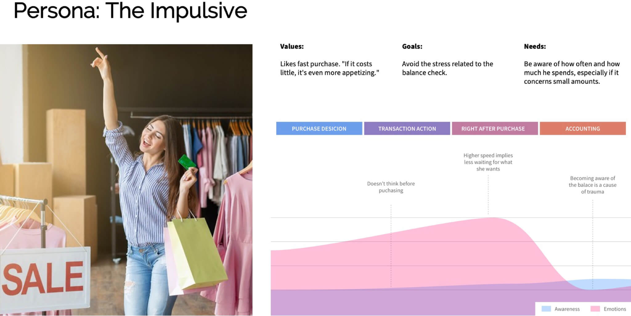
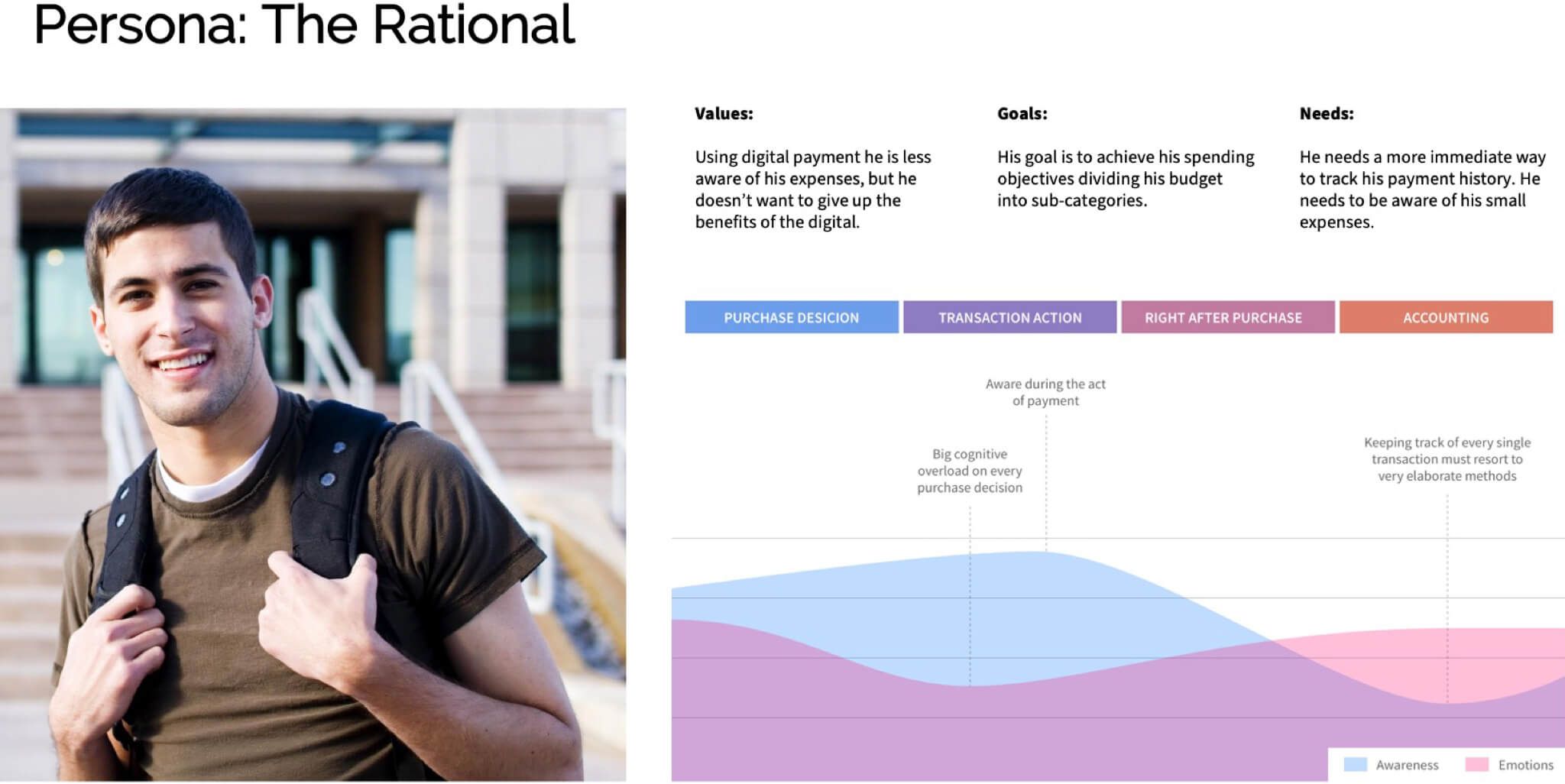
From interviews and competitive analysis we found:
- Users need immediate feedback showing the impact of a payment on their available budget.
- Classification of expenses is often done after the fact and is unreliable.
- Playful metaphors (visual, tangible metaphors) increase engagement and comprehension.
Flow & Interaction
Key interaction decisions:
- Pre-select budget: User chooses the budget container (e.g., Travel, Food) before paying — the expense is categorized immediately.
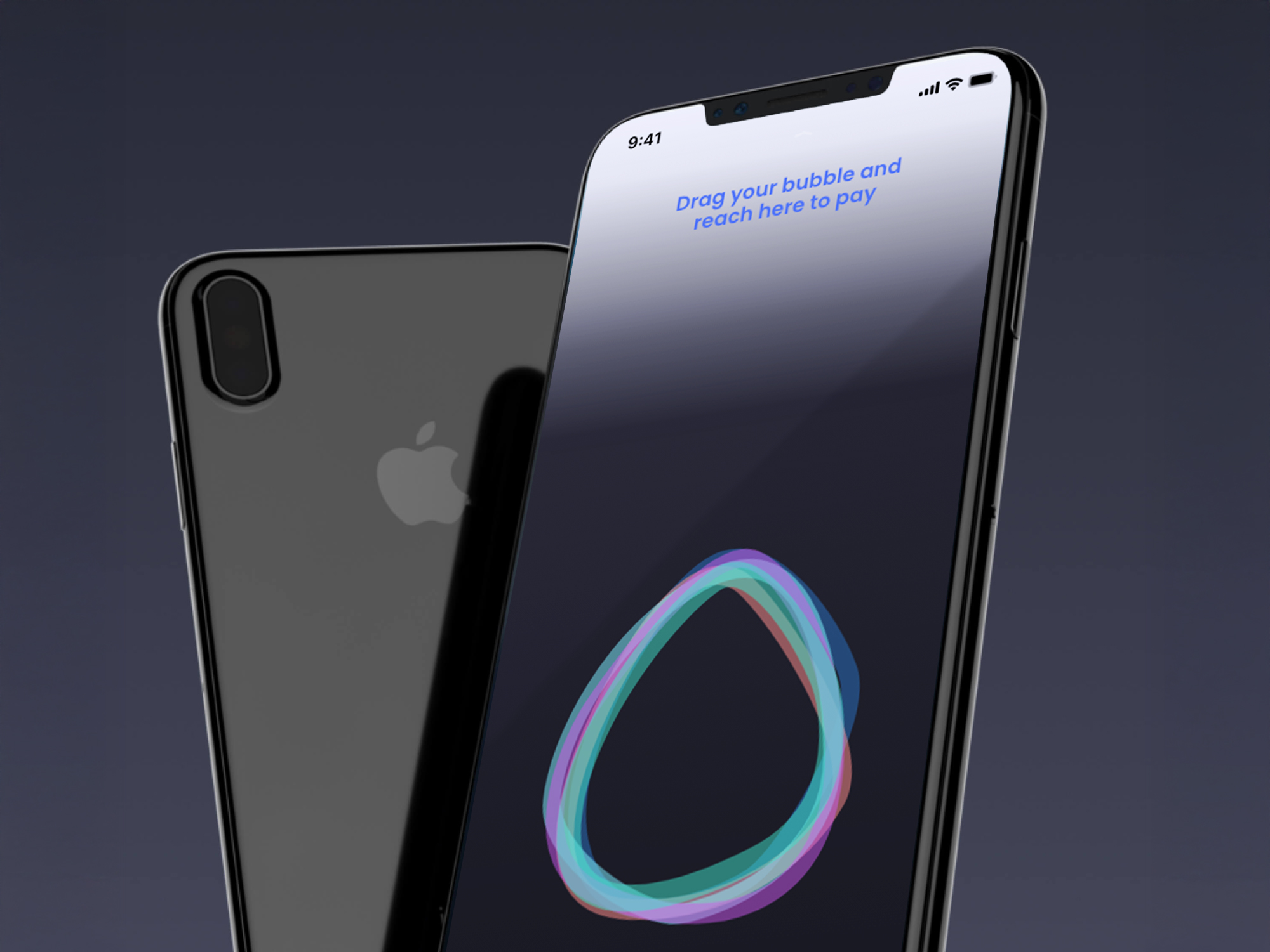
- Detach-to-pay gesture: Swipe up to detach a payment bubble from the budget; this gives a strong, legible metaphor for spending.
- Biometric confirmation: Face/fingerprint confirmation is requested before the action finalizes to balance security and fluidity.
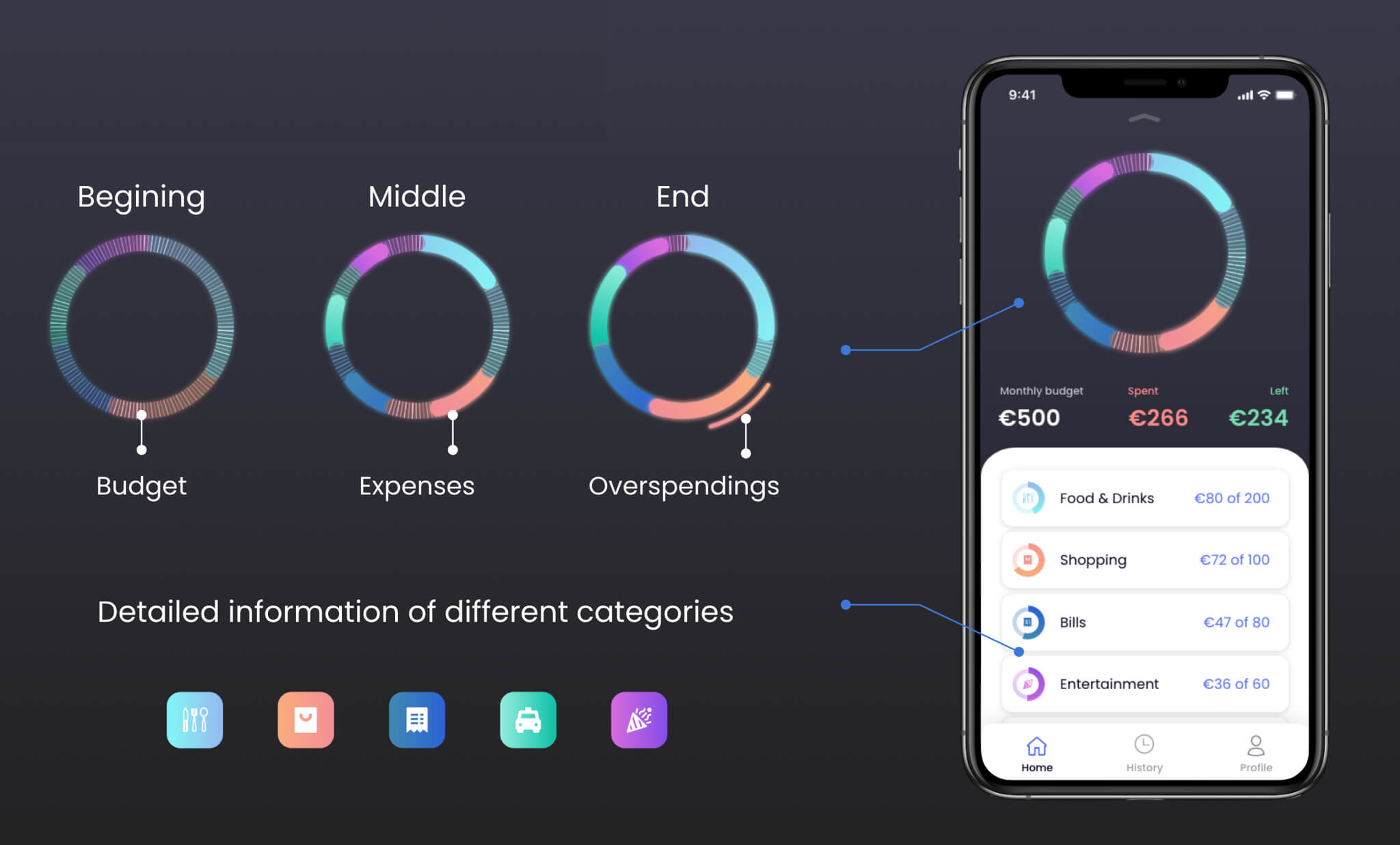
- Immediate visual feedback: Large bubble shrinks proportionally after payment; transactions feed the avatar progress meter.
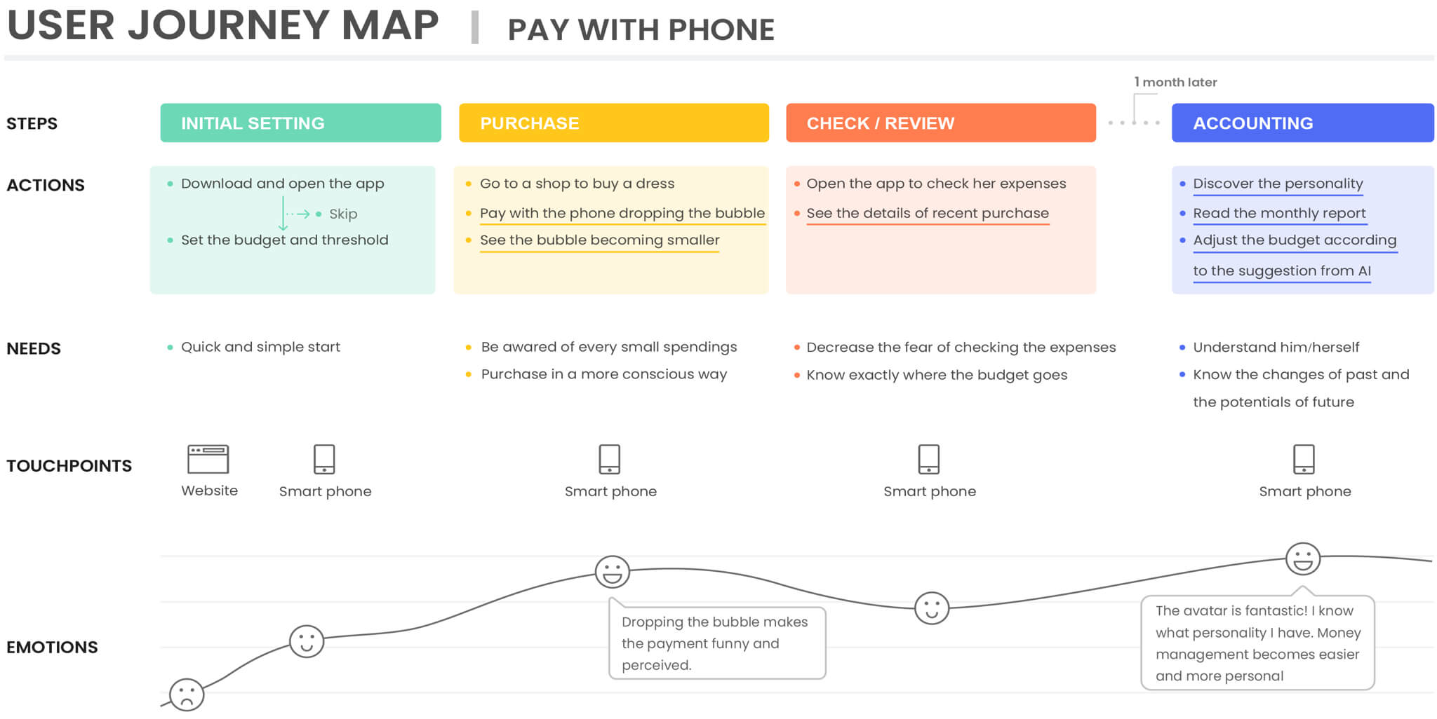
Prototype
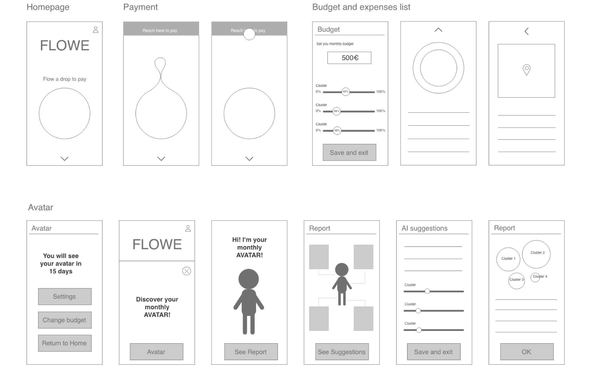
The interactive prototype shows:
The onboarding steps where user can set the month budget and the budgets of each category.
The payment metaphor: the user take visually a part of the budget and pay with the small bubble to generate awareness in the moment of payment.
How the expenses are tracked and categorized.
User profile and possible changes to budget.
Monthly report, budget suggestions and avatar discovering for gamification.
Results
- The avatar idea was incorporated in the Flowe app roadmap.
- Engineering teams engaged to explore production; an initial meeting resulted in an improved flow: select budget before swipe to guarantee correct categorization.
- The concept substantially reduced the expected manual work needed to label expenses, improving the product’s viability for real users.
Reflection
Designing MyBubble reinforced how a single, well-chosen metaphor can solve multiple UX problems (awareness, categorization, motivation). The challenge was balancing playful interaction with real security and technical constraints — and the collaboration with engineers early on proved critical.
Project Infos
Politecnico di Milano - Professional workshop with Banca Mediolanum
february 2020 - august/september 2025
In collaboration with Nikulina, Zhang, Zhou, Liao, Ye for the first part of February 2020.